At 3:40 p.m., the draft stopped because the mockup could not move
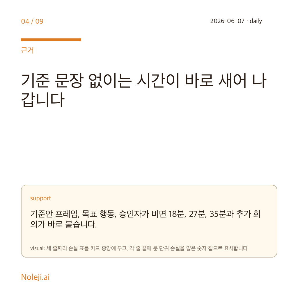
Last Thursday I watched a simple content page stall for 27 minutes over a tiny problem: the wording was ready, the layout was visible, but nobody in the room could turn the static screen into a working interaction without handing it off. That handoff is where a lot of office work still leaks time. When I saw the phrase “internal source material,” my interest was not the product branding. It was the possibility that the design file is trying to become a workbench, not just a picture.
My claim is blunt: if Figma turns design intent into executable prototypes inside the same surface, non-developers will benefit sooner than developers do.
Most teams still treat design tools like polite waiting rooms
The common belief is familiar. Design happens in Figma, real building happens somewhere else, and everyone accepts the gap as normal. I think that habit is more expensive than most teams admit.
In ordinary office life, “someone else will wire it later” sounds reasonable until you count the hops. A marketer writes the request, a designer interprets it, a PM rewrites it, and a developer rebuilds the intent from fragments. I have done my side of this chain too many times with Google Docs on one screen and a half-finished mockup on the other. The output was usually acceptable. The route was wasteful.
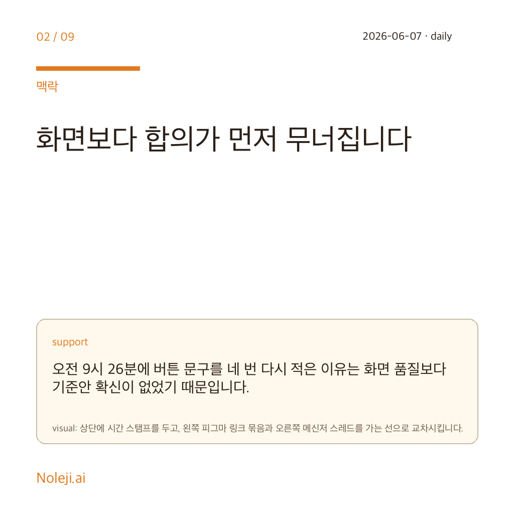
The trap is that a clean mockup creates false confidence. People assume the hard part is over because the screen looks settled. In practice, the expensive questions often start after the layout looks done: what happens when the field is empty, what text changes after a click, what breaks on mobile, which step can be automated, and who is allowed to fix it without booking another meeting.
The bigger shift is not AI inside design, but design becoming a small production system
I should be clear about the evidence first. The source brief here is thin. I do not have a full feature list, launch note, or benchmark to point to, so I cannot honestly claim what “Figma Make” does in detail. What I can defend is the direction implied by the signal, and why that direction matters.
Last week I rebuilt a tiny internal workflow for publishing cards and archive copy. Nothing fancy. One title, one summary, one CTA block, and a few states that changed depending on length. The content itself took me under 10 minutes. The coordination took longer than the thinking. I wrote the text in one place, checked layout in another, and translated behavior in a third. That is normal in many teams. It is also the reason simple work becomes half a day.
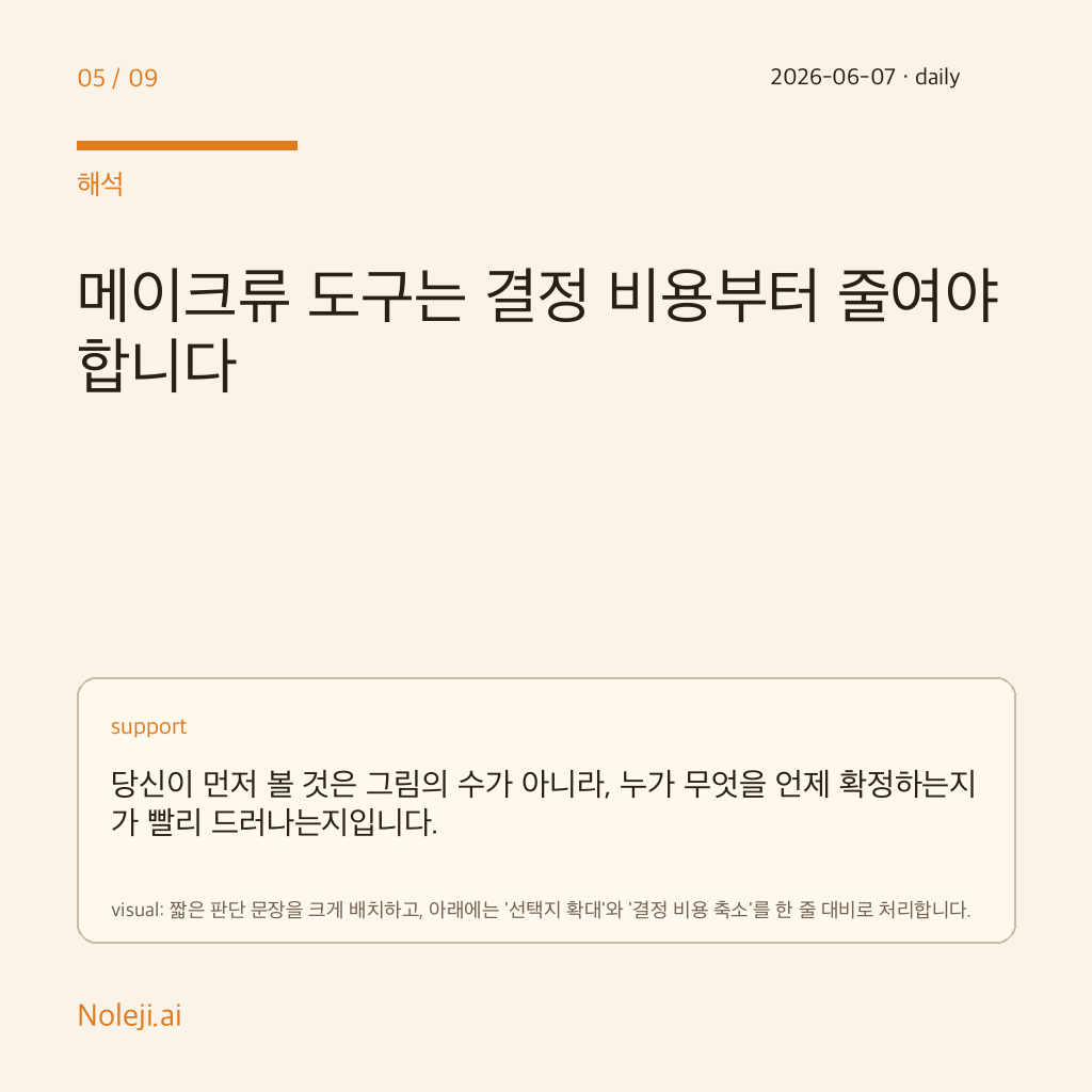
If a Figma-native “make” layer lets a designer, operator, or content lead move from frame to functional prototype without leaving the design context, the first win is not aesthetics. It is compression. Fewer retellings. Fewer interpretation errors. Less time spent converting “what I meant” into “what engineering heard.”
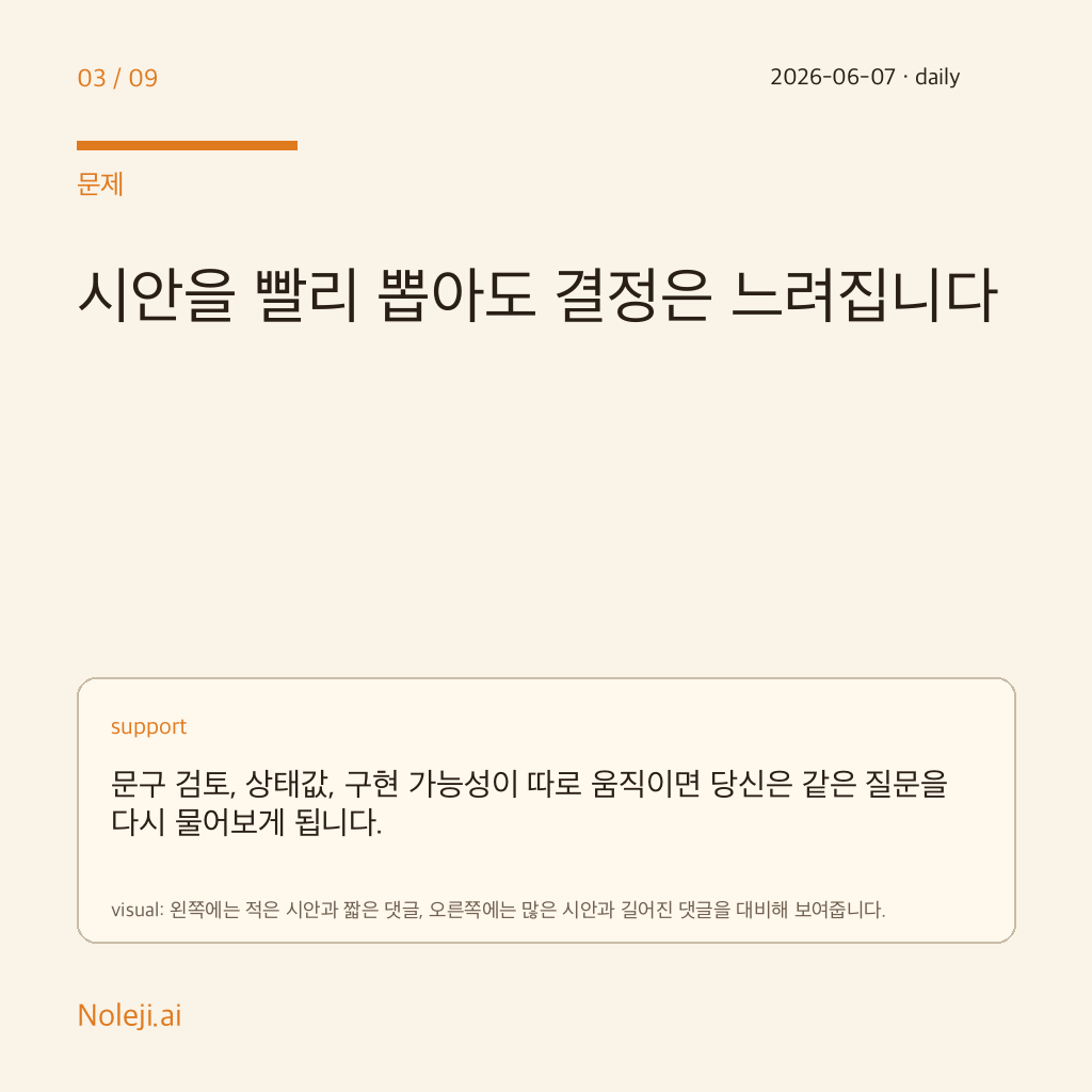
That matters especially for non-developers because we usually get punished by delay, not by syntax. A developer may lose an hour to implementation friction. A non-developer often loses the week to queue friction. The campaign cannot launch, the landing page copy stays provisional, the tutorial cannot be tested, and the client-facing promise remains “coming soon.” I care about tools that reduce that queue.
I have seen the opposite failure too. In one project, I assumed a clean design file would be enough for handoff. It was not. The button hierarchy was clear, but the actual user path was ambiguous in three places. By the time those questions surfaced, the writer had already finalized copy, the operator had scheduled the send, and the engineer had implemented the shortest interpretation. We did not fail because anyone was careless. We failed because the system asked each person to imagine the missing behavior separately.
That is why I think tools like this matter more than another gallery of AI-generated screens. A generated screen saves some drafting time. A design surface that can express behavior saves organizational time. Those are different categories.
Here is the portable test I would keep:
| Question | Static design file | Design-to-make workflow |
|---|---|---|
| Can I show the happy path? | Usually yes | Yes |
| Can I test edge cases before handoff? | Often no | More likely |
| Can a non-developer fix obvious wording and flow issues directly? | Rarely | Possibly |
| Does engineering still need to rebuild intent from scratch? | Often yes | Less often |
| Does this reduce meetings or just create prettier artifacts? | Usually prettier artifacts | Potentially fewer meetings |
For me, the key question is simple: does this shorten the distance between “I can see it” and “I can try it”?
If the answer is yes, then Figma stops being a presentation layer and starts becoming a small systems layer for teams that do not have spare engineering time.
This will not rescue messy teams by itself
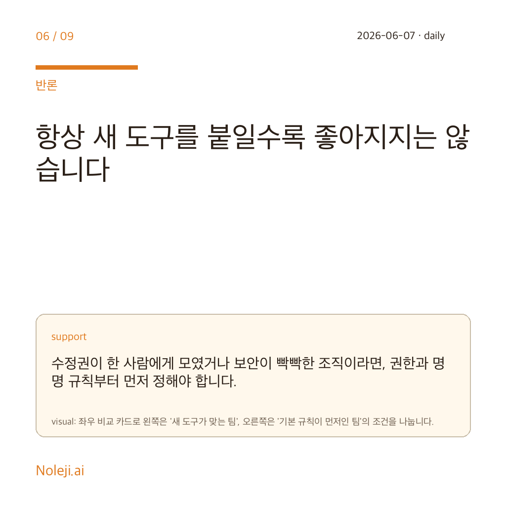
There are real limits. If the underlying workflow is chaotic, adding an AI-assisted build layer may only accelerate confusion. I have watched teams automate the wrong thing with great enthusiasm.
It also will not replace engineering judgment where reliability, security, or complex logic matter. A prototype that behaves well in a design tool is not the same as a production system with permissions, analytics, rollback, and maintenance. And if the feature turns into one more shiny panel that only power users touch, then the promise collapses back into demo theater.
I would also worry about a quieter failure mode: teams using “make” features to skip thinking. If nobody defines the user path clearly, faster generation just produces faster ambiguity.
Keep one screen, one path, and one handoff under a stopwatch
If I were testing this seriously today, I would not begin with a flagship redesign. I would pick one small workflow that currently dies in handoff.
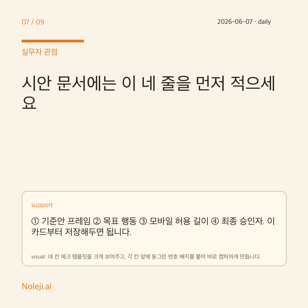
① Choose one screen with a real business consequence: signup step, inquiry form, onboarding card, pricing explanation, or internal request flow. ② Time the current route from copy draft to clickable prototype. Last week, one of mine took 27 minutes longer than it should have. ③ Ask one non-developer teammate to make a behavior change without opening a second tool. If they cannot, the bottleneck is still there.
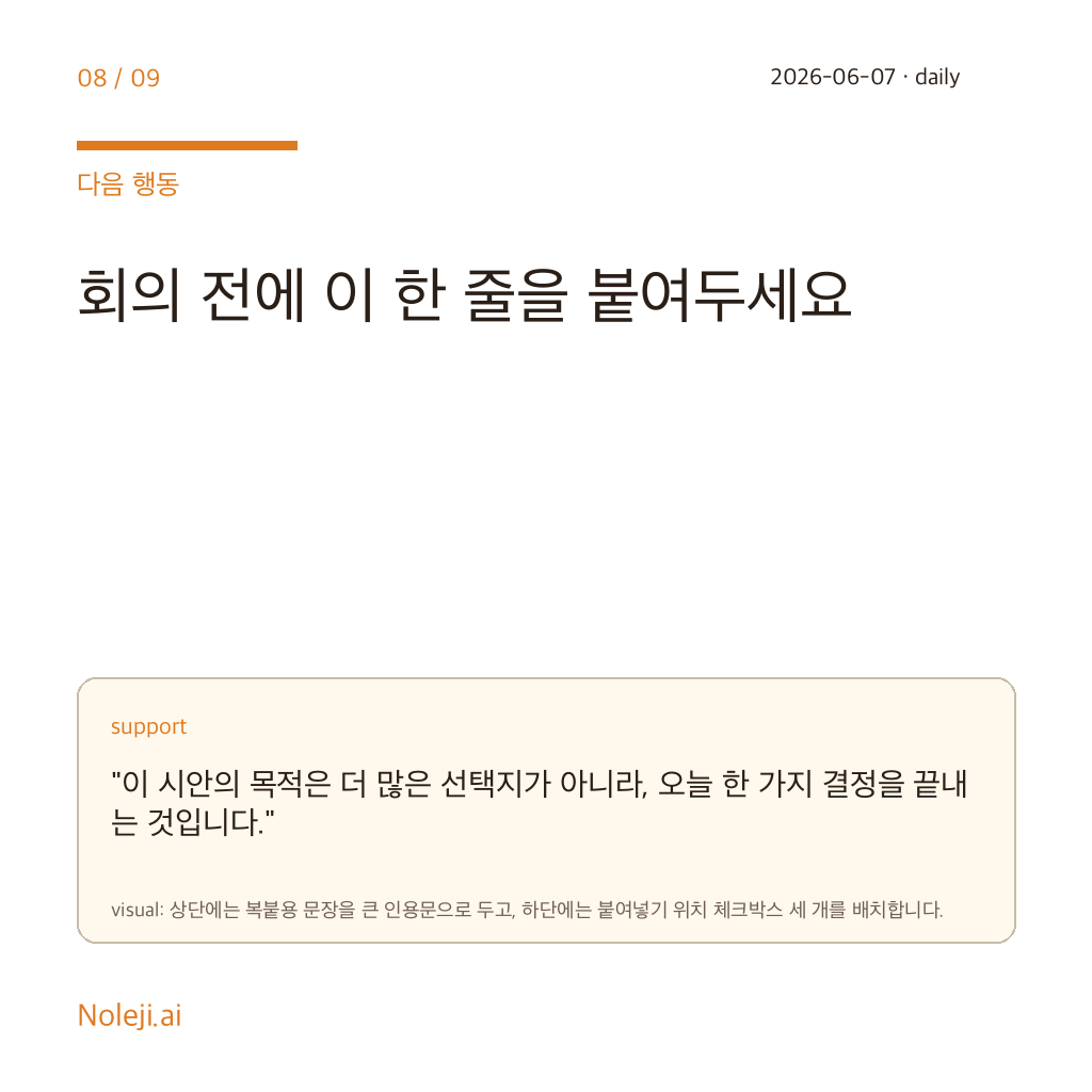
My copy-paste line for that test would be:
> “Can this screen move from approved idea to clickable behavior without a retelling step?”
That is the standard I would use for any “make” promise. Not whether the demo looks smooth. Whether the team gets back one quiet hour each week.
If you follow this archive, the next useful step is simple: keep a one-week log of where your mockups stop and handoffs start. In the next piece, I will turn that into a small evaluation rubric for AI design tools that non-developers can actually use before buying into the story.
Take-aways
- Last Thursday I watched a simple content page stall for 27 minutes over a tiny problem: the wording was ready, the layout was visible, but nobody in the room could turn the static screen into a working interaction without handing it off
- My claim is blunt: if Figma turns design intent into executable prototypes inside the same surface, non-developers will benefit sooner than developers do.
- The common belief is familiar
→ 한국어 버전 →