Ten minutes is enough to build the page, not enough to decide what the page should be
At minute 7, Claude Code can already give you a working website.
That is the part people notice. A blank folder becomes a homepage, cards appear, buttons line up, and the whole thing feels strangely close to finished. If you are not a developer, this looks like the magic moment.
I think that is the wrong lesson.
The real skill is not “make Claude Code build a website in 10 minutes.” The real skill is learning how to stop AI from giving you the average internet. Claude Code is fast, but speed mainly helps after you have decided what kind of page deserves to exist.
Most people start with code because code feels like progress
The common move is simple: open Claude Code, ask for “a modern landing page,” and wait. I have done this too.
The result usually looks competent in the most forgettable way. Big gradient. Rounded cards. Generic headline. Three feature blocks. A CTA that could belong to a SaaS tool, a coaching business, or a productivity app. Nothing is broken, but nothing is owned.
For a non-developer office worker, this is like asking a new intern to “make a presentation about our product” without giving them the audience, the argument, or the one slide the boss must remember. The intern may work hard. The deck may look clean. It still misses the point.
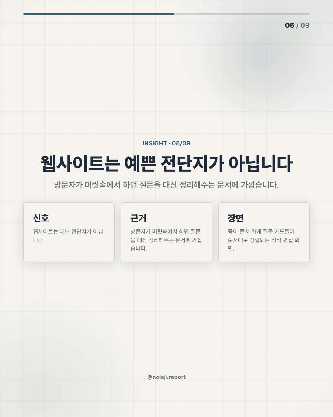
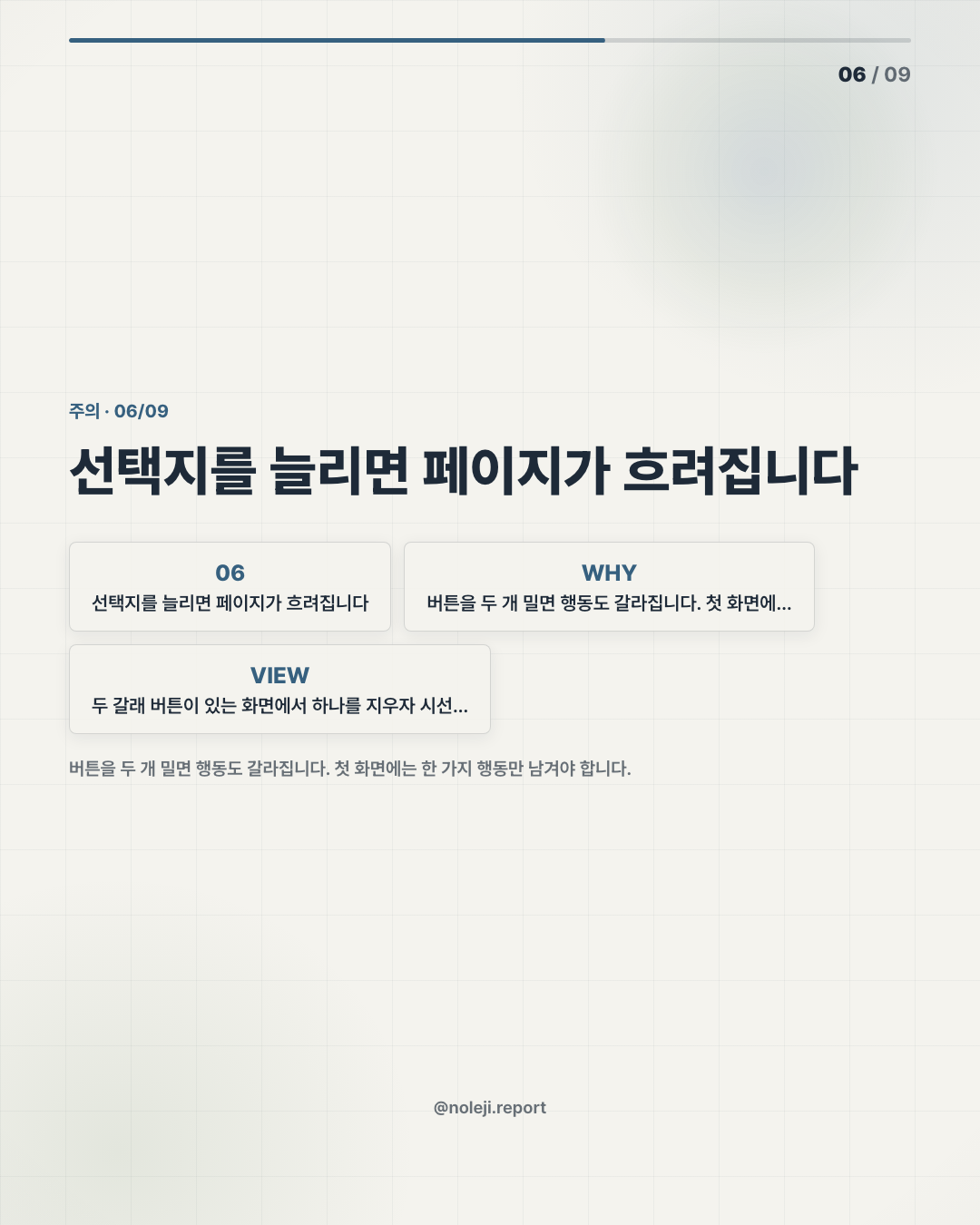
Claude Code has the same weakness. It follows the strongest default in your prompt. If your prompt is vague, the default becomes the design language of thousands of startup templates.
That is why I take a fairly firm position here: if the first instruction you give Claude Code is about layout or components, you are already late. The first instruction should be about the message.
The 10-minute website works when copy leads and Variant narrows the visual field
My working thesis is this: Claude Code is best used as an execution engine, not a taste engine.
Someone can disagree with this. There are cases where Claude produces a surprisingly polished first draft. But for a “big design” website, especially one that has to feel like a real brand rather than a demo, I would not let the coding agent decide the visual argument from scratch.
The better order is:
① Write the page’s claim in plain language ② Use Variant to explore a stronger visual direction ③ Give Claude Code both the copy and the visual rules ④ Ask it to build the page, then remove anything that feels like AI default ⑤ Run one final pass for spacing, hierarchy, and mobile reading
The important part is step ①. Before touching code, I want one sentence that says what the page is really doing.
For example:
> “This page should make a busy founder feel that AI publishing can become a weekly operating system, not another content task.”
That sentence does more work than “make it sleek and modern.” It tells the system who is reading, what they are tired of, and what emotional shift the page must create.
Variant helps because it gives the work a visual boundary before Claude Code begins. I am not using it as decoration. I am using it to avoid the blank-page default. If the direction is editorial, calm, and structured, Claude should not suddenly produce neon gradients and giant floating cards. If the direction is premium but practical, the page should not become a luxury perfume site.
Here is the small comparison I keep for myself:
| Bad starting point | Better starting point |
|---|---|
| “Build a modern website” | “Build a founder-facing editorial landing page about AI publishing as a repeatable system” |
| “Use beautiful design” | “Use restrained spacing, strong typography, and one visual anchor per section” |
| “Make it impressive” | “Make the visitor understand the offer in 8 seconds without hype” |
| “Add sections” | “Only add sections that answer a real objection” |
| “Looks good on desktop” | “Make mobile reading feel intentional, not compressed” |
In my own tests, the biggest improvement did not come from longer prompts. It came from removing vague words. “Premium,” “clean,” and “futuristic” are weak unless you define what they mean on the page.
A stronger instruction looks like this:
> “Avoid generic SaaS patterns. No oversized gradient hero, no random icon cards, no vague productivity copy. Use the supplied headline and build a page that feels like an edited briefing: calm, spacious, useful.”
That one line can save several rounds of cleanup.
The 10-minute claim is still useful, but only if we understand what is being timed. You can get a first version quickly. You cannot outsource judgment in 10 minutes. Claude Code can arrange the room. It should not decide why the meeting exists.
This does not work when the offer is still unclear
There is one case where this workflow fails almost every time: when the product owner cannot say what the page is supposed to make the reader believe.
I have seen this happen with AI tools, newsletters, consulting pages, and internal automation dashboards. The prompt asks for design, but the real missing piece is positioning. Claude Code then fills the gap with familiar language: save time, boost productivity, streamline workflows.
Those phrases are not evil. They are just too available.
Another limit: if you do not have enough visual judgment to reject the first polished draft, AI speed becomes dangerous. A page can look “finished” before it is strategically clear. That is worse than a rough draft, because a finished-looking weak page is harder to question.
So I would not use this method for a brand-defining homepage without a human design review. I would use it for prototypes, campaign pages, internal tools, newsletter landing pages, event pages, and early product tests where learning speed matters.
The evidence in this archive note is practical rather than sourced. There are no external sources attached to this brief, so I am not treating it as an industry benchmark. I am treating it as a working method: copy first, visual boundary second, code third.
Today’s move: write the page before you generate the page
If you want to try this today, do not begin inside Claude Code.
Open a plain note and write these four lines first:
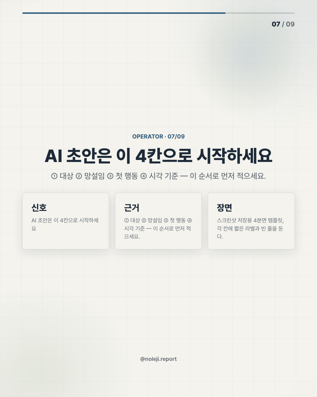
① Who is this page for? ② What are they already tired of? ③ What should they understand in the first 8 seconds? ④ What should they do next?
Then turn those answers into one instruction for Claude Code. Keep it specific. Keep it human. Ban the obvious AI defaults before they appear.
My copy-paste line would be:
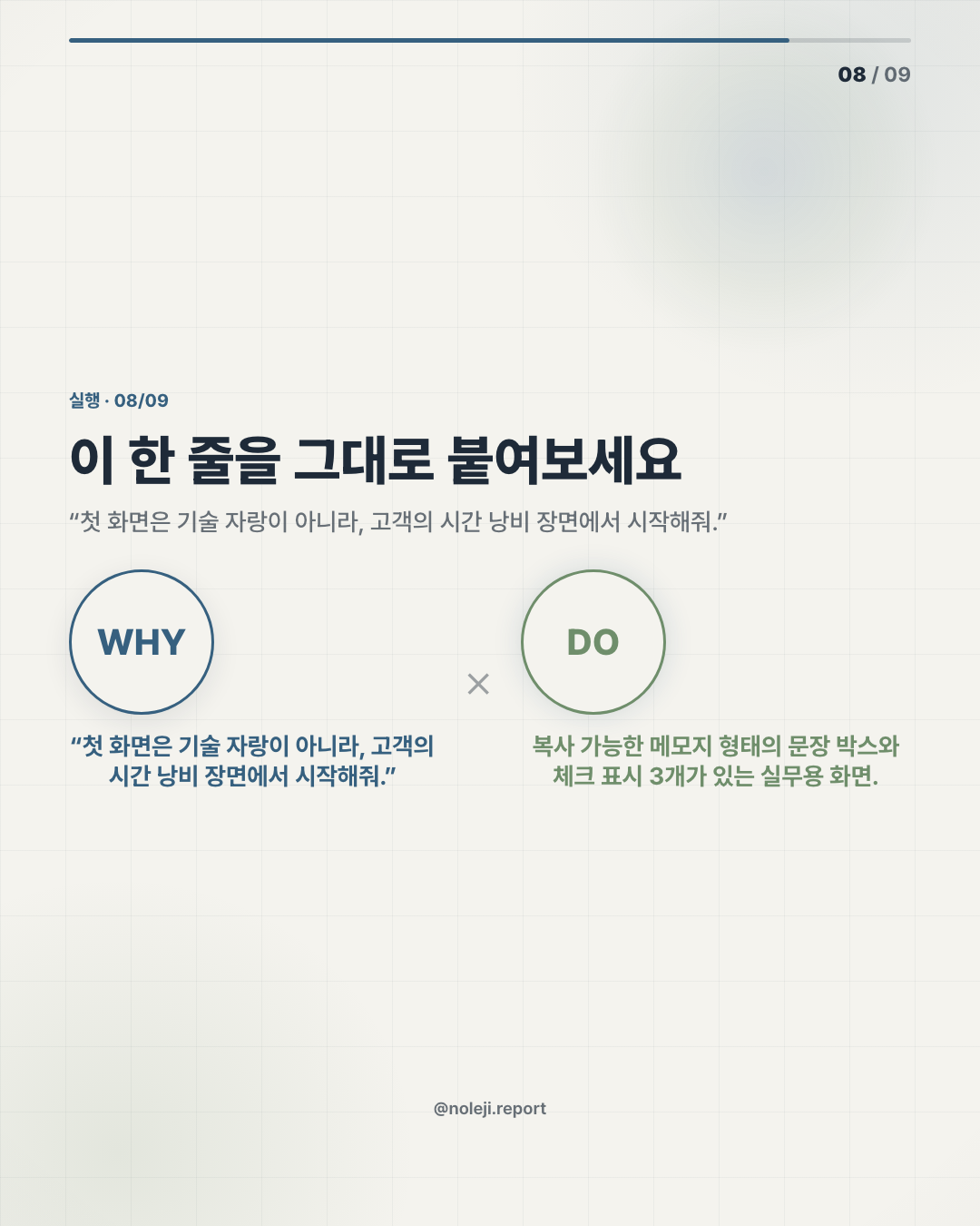
> “Build this as a real editorial website, not a template demo. Preserve the argument, reduce generic sections, and make every visual choice support the reader’s next decision.”
Primary next step: subscribe to the free newsletter for the next practical translation of AI workflows: https://maily.so/tenbuilder
Next issue: how I would turn this same Claude Code workflow into a repeatable checklist for non-developers building small business tools.
Take-aways
- At minute 7, Claude Code can already give you a working website.
- That is the part people notice
- I think that is the wrong lesson.
→ 한국어 버전 →