Three Tabs, Two Flat Mockups, One Useful Realization
At 11:40 p.m. last week, I had Claude Code open on one screen, a Netlify preview on another, and two design outputs that looked tidy but forgettable. The problem was not that the model was weak. The problem was that I had asked it to “make it look good,” which is the design equivalent of telling a new hire to “handle it” and then acting surprised when the result drifts.
That moment matters to ordinary office workers more than it sounds. If your job includes publishing, reporting, documenting, or packaging ideas for other people, you do design work whether your title says so or not.
Most People Hunt for Better Taste, When the Real Gap Is Better Procedure
The common move is easy to recognize. We keep collecting stronger models, sharper prompts, nicer references, and hoping the screen will suddenly come out clean. I used to do the same thing, especially when I felt I was “close” and just needed one more iteration.
I think that habit is the trap.
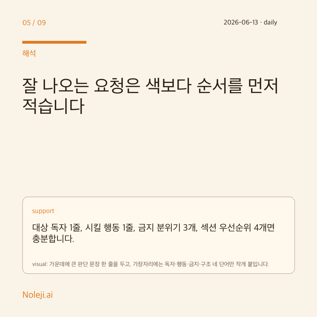
For non-designers using coding agents, the best design skill is usually not the one that produces the most visually impressive first draft. It is the one that forces a usable sequence: brief, direction, constraints, output shape, and revision logic. Some people will disagree and say taste is still the whole game. I do not buy that. In real work, repeatability beats one lucky screen.
The Skill Matters Because It Turns Vague Taste Into Repeatable Work
What changed my mind was not a keynote or a benchmark chart. It was a small open-source repo: `uxjoseph/supanova-design-skill`, plus the public Netlify result linked alongside it. The evidence is still thin, and I want to say that plainly because I am working from a light source set here, not a deep technical teardown. But even with limited material, the difference in framing is clear enough to be useful.
My thesis is simple: the most valuable Claude Code design skill is the one that behaves less like a prompt and more like an operating procedure.
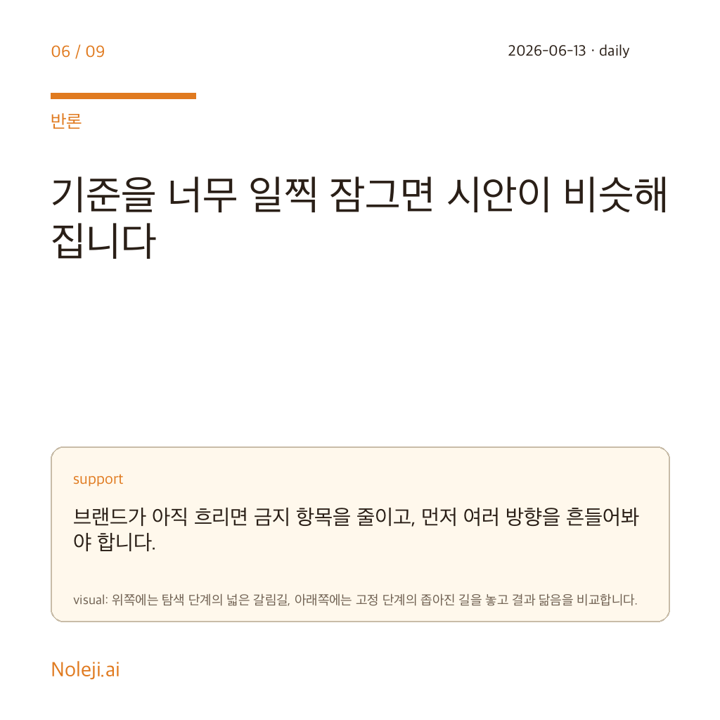
That sounds modest, but modest systems are often what save real time. When I look at why many AI-made pages feel interchangeable, the failure usually happens before the visuals. The request is too foggy. The designer in your head knows what “premium but warm” means, but the model does not. A reusable skill closes that translation gap.
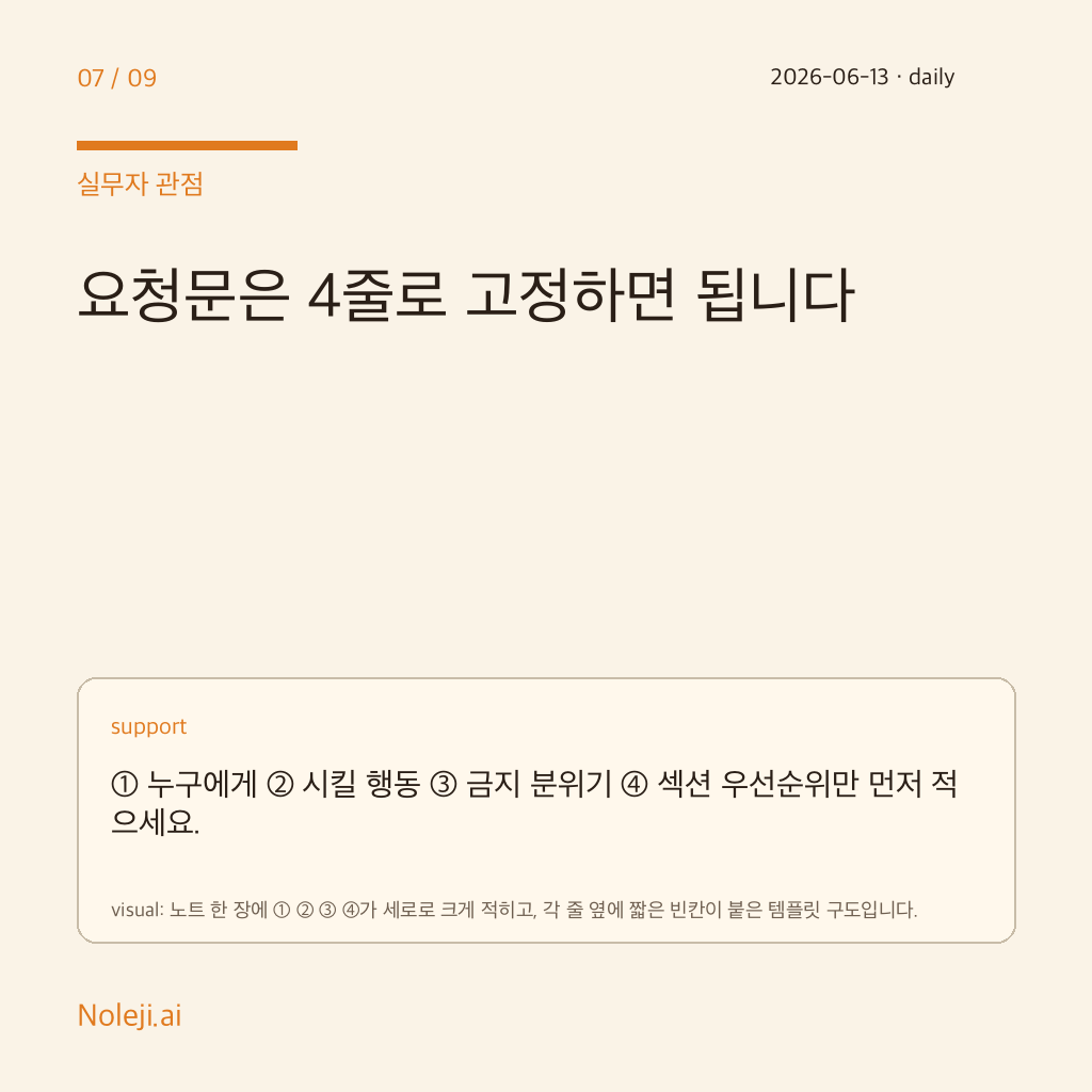
This is why I take the Supanova-style approach seriously. It is free, open source, and more importantly, it suggests a way of working that a non-developer can keep. Instead of squeezing harder on wording, you define the lane first. What kind of page is this? Who is it for? What emotional temperature should it have? What should stay restrained? What must never happen? Those are not decorative questions. They are production questions.
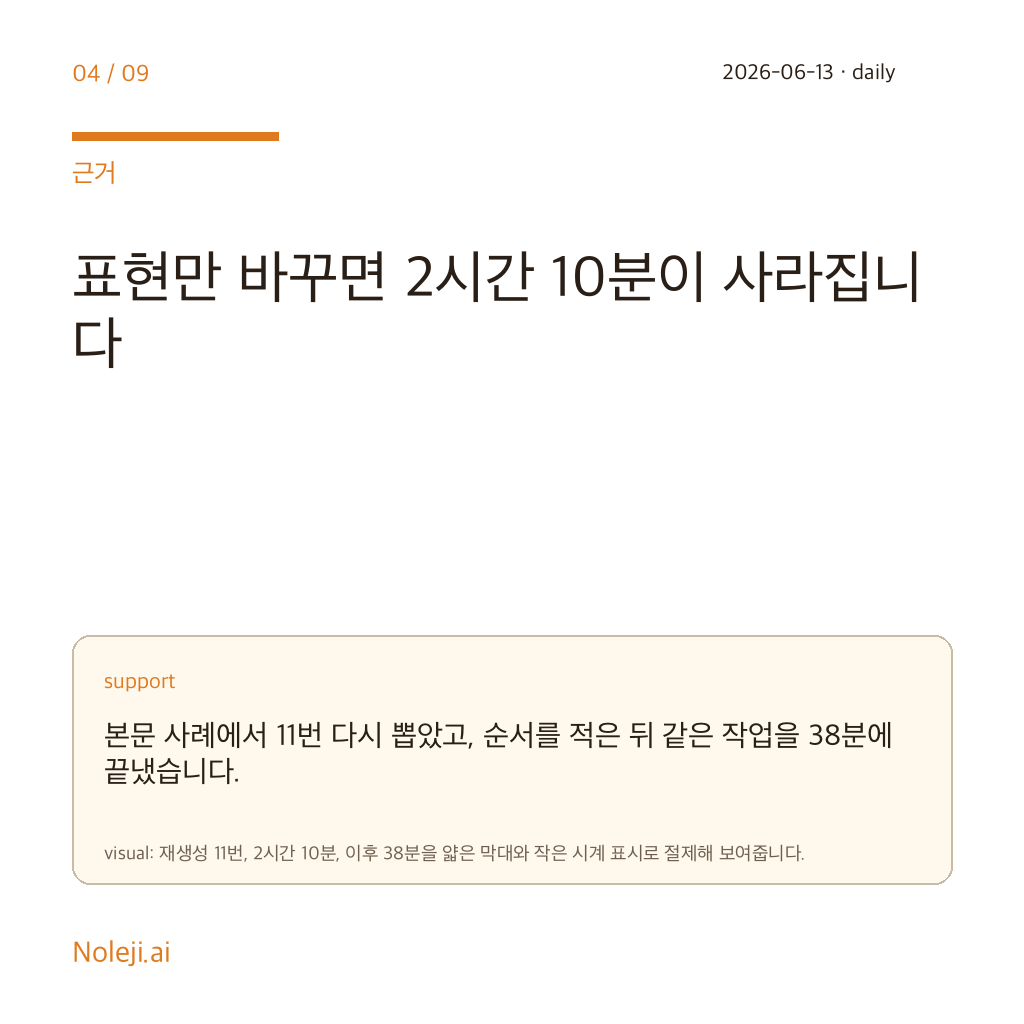
Last month I wasted nearly two hours on a landing page draft because I kept revising the surface instead of the instruction stack. I changed button labels, hero copy, spacing, even color references. The page kept getting “different” without getting clearer. That is a familiar office problem, not a design problem. It is the same mistake people make in document work when they edit the final slide before agreeing on the message.
What I now want from a design skill is not magic. I want discipline I can reuse.
Here is the comparison I wish I had kept earlier:
| Approach | What I ask for | What usually happens | What I can reuse later |
|---|---|---|---|
| Raw prompt chasing | “Make this look modern and polished” | Fast variation, weak consistency | Almost nothing |
| Reference copying | “Make it like this site” | Better aesthetics, shallow fit | A mood, not a system |
| Skill-based workflow | “Use this brief, these constraints, this output structure” | Slower start, stronger coherence | A repeatable method |
That tradeoff matters. A skill-based workflow is not the fastest path to your first screen. It is often the fastest path to your third useful screen, which is what work actually needs.
If you are a non-developer operator, editor, marketer, or translator, this is the practical test I would use before trusting any design skill:
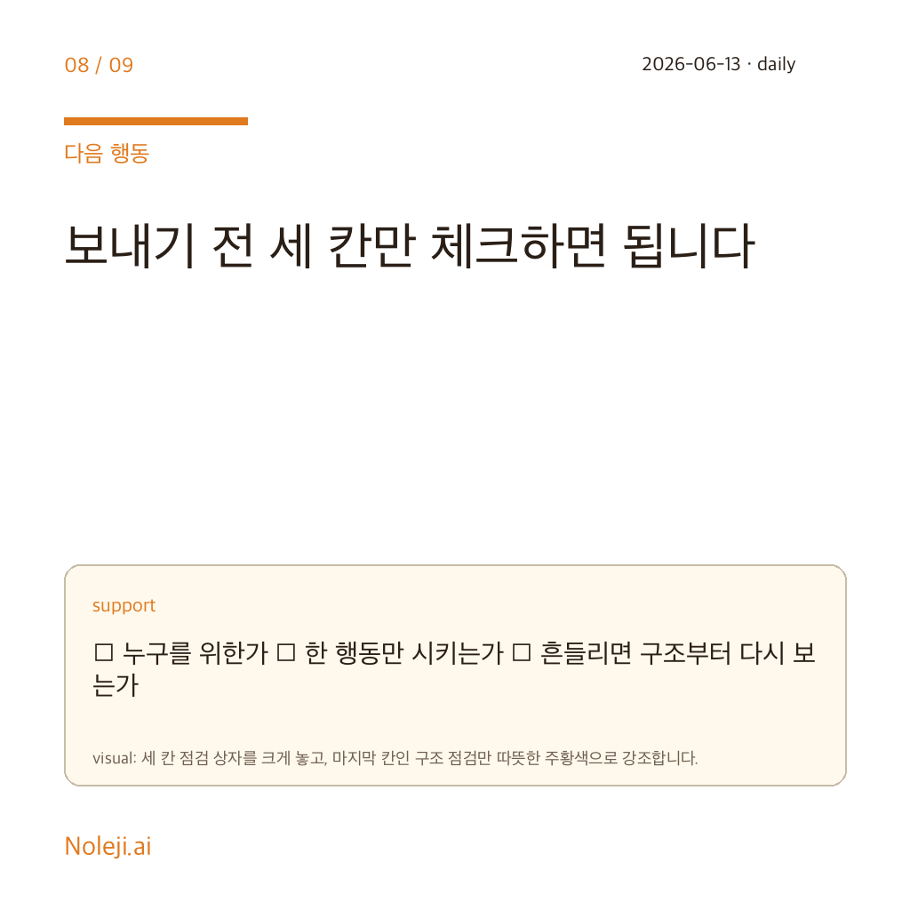
- Does it force a clear brief before code starts?
- Does it separate visual direction from implementation details?
- Does it make revision rules explicit instead of emotional?
- Can I hand the same structure to a teammate next week?
- If the output is mediocre, can I tell which step failed?
If the answer is no to three of those, you probably found a flashy prompt, not a durable skill.
One line worth keeping on your desk is this:
> Do not ask the model for taste first. Ask it for a design working method you can inspect.
That sentence changed the quality of my outputs more than any “best UI prompt” thread I saved this year.
This Will Not Rescue Weak Judgment or Thin Source Material
There are limits, and they matter.
A structured skill cannot replace actual editorial judgment. If the product is muddy, the audience is unclear, or the content itself has no point of view, the workflow will only help you fail more neatly. I have seen that too. Once, I had a beautifully arranged draft page for a content project whose core message still made no sense. The screen looked composed. The work was still not ready.
This also breaks down when people use a design skill as a status shortcut. Some teams do not want a better process. They want a fast artifact that looks finished enough to move the meeting along. In those cases, no open-source skill will save you, because the bottleneck is organizational honesty.
And because the available evidence here is limited, I would not claim this is the final answer for every workflow. I would claim something narrower and more defensible: this is one of the more useful directions I have seen because it packages design generation as a system, not a vibe.
Start With One Brief You Can Reuse Tomorrow
If I were you, I would not begin by asking Claude Code for a homepage redesign tonight. I would begin smaller.
① Pick one page you already need for work: a landing page, article layout, portfolio section, or internal showcase page. ② Write five constraints before any styling request: audience, purpose, tone, visual restraint, and what success should feel like. ③ Run the skill against that brief once, then review the result like an operator, not a fan. What is reusable? What is vague? What failed because you were unclear?
That is the first move I would make because automation is most useful when it gives back the hour after the first experiment, not just the thrill of the first experiment itself.
My one next step for you is simple: save the checklist above and test one real page with a fixed brief instead of a clever prompt.
In the next piece, I will show the exact brief structure I now use to get cleaner design output from coding agents without turning the process into another full-time job.
Take-aways
- At 11:40 p.m
- That moment matters to ordinary office workers more than it sounds
- The common move is easy to recognize
→ 한국어 버전 →