Ten minutes is not the point
At 9:40 a.m., you still have a blank browser tab, a half-written product idea, and a 10 a.m. meeting where someone will ask, “Can we see what this looks like?”
That is the real use case for Claude Code with a design tool like Variant. Not replacing a designer. Not “building a full website in 10 minutes.” The useful claim is narrower, and I think more important: non-developers can now turn a vague website idea into a concrete design draft fast enough to improve the conversation.
My thesis is this: Claude Code is not a shortcut around taste. It is a shortcut around the empty starting screen.
The trap is asking AI to “make it beautiful”
Most people fail with these tools for a boring reason. They ask like a client giving a mood: “Make a modern website for my brand.” The AI then gives back what it thinks “modern” means. Usually that means a gradient hero, oversized headline, soft cards, and copy that sounds like every SaaS landing page from the last five years.
I have made this mistake myself. Last week I tested a simple service page prompt and got a clean-looking page that was almost useless. The spacing was fine. The colors were fine. But nothing on the screen helped me decide whether the offer was clear, whether the first button made sense, or whether the page looked trustworthy for the actual buyer.
That is why I would not teach this as “how to design a website with AI.” I would teach it as “how to brief a junior designer who works at software speed.”
A junior designer does not need your adjectives first. They need constraints.
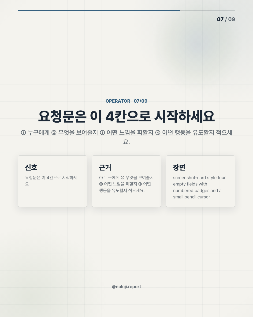
Who is the page for? What should the first screen make them understand? What action should they take? What should the page avoid looking like? What examples are close, and what examples are wrong?
Claude Code can move quickly, but speed makes weak instructions more visible. If the request is vague, you just get vague output faster.
The real workflow is prompt, inspect, correct, repeat
The reason this matters for office workers is not that everyone suddenly becomes a web developer. Most people do not want that job. The bigger shift is that the cost of making a visual first draft has dropped.
Before, a marketing manager, consultant, coach, internal operator, or solo founder had three bad options. Write a long Notion doc and hope someone visualizes it correctly. Make a clumsy slide mockup. Or wait for a designer or developer before the idea can be judged on screen.
With Claude Code, the first draft can become an object you can react to. With Variant in the loop, the design direction can become less generic because you can push the system toward a larger visual language instead of settling for default AI-webpage taste.
But the operator still has to lead.
Here is the simple distinction I use:
| Bad request | Better request |
|---|---|
| “Make a beautiful AI website.” | “Create a one-page website for non-technical managers evaluating an AI workflow service. It should feel calm, credible, and practical, not futuristic.” |
| “Use a modern design.” | “Use a clean editorial layout with strong hierarchy, restrained color, and a first screen that explains the outcome in under 8 seconds.” |
| “Add sections.” | “Include: problem, workflow, proof, pricing preview, and one clear call-to-action. Do not add testimonials unless I provide them.” |
| “Make it premium.” | “Avoid glossy gradients, fake dashboard cards, and exaggerated claims. Make the page feel like a serious consulting offer.” |
The 10-minute part only works if the thinking has already happened. I would spend the first 3 minutes writing the brief, 4 minutes generating the first version, and the remaining 3 minutes fixing the biggest mismatch.
That sounds too small, but it changes the work. The first version is no longer the final answer. It is a thinking surface.
A practical Claude Code prompt might look like this:
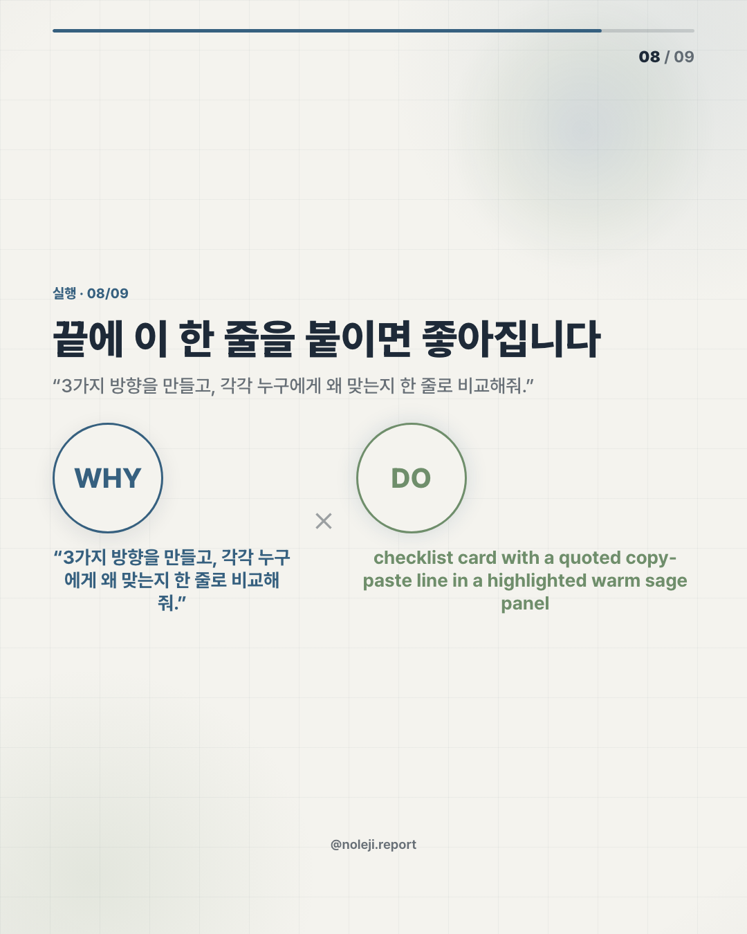
> Build a single-page website draft for [audience] who needs [outcome]. The page should make one promise: [specific promise]. Use a calm editorial style, not a hype-heavy startup landing page. First screen must include the offer, who it is for, and one primary action. Avoid fake metrics, fake testimonials, and vague AI words. After building, list three design choices you made and what tradeoff each one creates.
That last sentence matters. I want the tool to explain its design choices because it gives me something to argue with. If Claude Code says it used a large hero headline for clarity, I can decide whether clarity is actually the issue. If it says it used cards for scannability, I can ask whether the page has become too fragmented.
This is where Variant can help. I would use it less as decoration and more as a direction-setter: stronger layout, bolder composition, cleaner visual hierarchy, more deliberate spacing. The title says “large design,” and I read that as a useful phrase. Big design does not mean louder design. It means the page has a point of view before the details arrive.
There is one honest caveat: the manifest here does not include source links, benchmarks, or a verified demo. So I am not treating “10 minutes” as a measured performance claim. I am treating it as an practical check. The meaningful fact is not that every person can ship a polished production website in exactly 10 minutes. The meaningful fact is that a first design conversation can now happen before the meeting ends.
This breaks when you confuse draft with judgment
There are places where this workflow does not work well.
If you need brand-level originality, a conversion-tested landing page, accessibility review, production-ready performance, complex animations, payment flows, legal copy, or a site that will carry paid traffic tomorrow, a 10-minute AI-generated draft is not enough. It may even be dangerous because the page can look more finished than it really is.
I would also be careful with industries where trust depends on precision: medical, legal, financial, education, enterprise security. A polished screen can hide weak claims. For those pages, the copy, evidence, compliance language, and user path matter more than visual speed.
The non-developer mistake is to think, “It looks real, so it is ready.”
My safer rule is: if the website changes someone’s money, health, legal position, or professional reputation, the AI draft is only a sketch. Useful, but still a sketch.
A small system you can reuse tomorrow
If I were a non-technical worker trying this today, I would not start with a full website. I would make a reusable design brief and run one page through it.
Keep this checklist:
- ① Who is this page for, in one sentence?
- ② What should they understand in the first 8 seconds?
- ③ What should they do next?
- ④ What should the page never claim?
- ⑤ What should the design feel close to?
- ⑥ What should it avoid looking like?
- ⑦ What proof do I actually have?
- ⑧ What is still only an assumption?
Then ask Claude Code to build only the first screen and one supporting section. Inspect that. If the first screen is unclear, a full website will only multiply the confusion.
My recommended next step: save the prompt above, replace the bracketed parts with one real offer from your work, and generate only a first-screen draft before asking for the full page.
Next time, I will break down the exact “non-developer website brief” I would use before opening Claude Code, including the sentences that prevent AI pages from becoming generic.
Take-aways
- At 9:40 a.m., you still have a blank browser tab, a half-written product idea, and a 10 a.m
- That is the real use case for Claude Code with a design tool like Variant
- My thesis is this: Claude Code is not a shortcut around taste
→ 한국어 버전 →